
How Color Choices in Your Bedroom Affect Relationship Intimacy: A Color Psychology Guide for Couples
Quick FAQ
Q1: Which bedroom colors are best for enhancing romance and intimacy?
A: Warm colors like soft reds and pinks as accents can enhance passion, while purples balance relaxation and intimacy. Earth tones create security that supports vulnerability.
Q2: Can bedroom colors really affect my relationship?
A: Yes. Colors influence mood, sleep quality, and stress levels—all factors that impact relationship dynamics and communication patterns between partners.
Q3: We have different color preferences. How can we create a bedroom we both enjoy?
A: Apply the 60-30-10 rule: use a mutually agreeable neutral for 60% of the room, then incorporate each person's preferences in the secondary (30%) and accent (10%) colors.
Q4: What colors should we avoid in the bedroom?
A: Avoid overwhelming amounts of bright red (too stimulating), stark whites (too clinical), or very dark colors in small spaces (can feel confining). Instead, use these as accents if desired.
Q5: How can we personalize our bedroom colors beyond basic color psychology?
A: Incorporate colors from meaningful shared experiences—your wedding palette, favorite vacation destination, or the season when you met—to create a space that tells your unique story.
Have you ever walked into a bedroom and immediately felt something shift in your mood? Perhaps you've noticed that hotel rooms with certain color schemes seem to inspire more connection between you and your partner. This isn't a coincidence—it's bedroom color psychology at work.
Your bedroom is more than just a place to sleep. It's where you connect, communicate, and cultivate intimacy with your partner. The colors surrounding you in this personal sanctuary have a profound impact on your emotions, behavior, and even your relationship dynamics.
Research in color psychology suggests that the colors we choose for our most personal spaces reflect our emotional needs. And when it comes to creating a space that nurtures your relationship, those choices become even more significant.
In this guide, we'll explore how different bedroom colors influence relationship intimacy and how you can use this knowledge to create a space that strengthens your connection. Whether you're redecorating or just curious about why your current bedroom feels the way it does, understanding color psychology gives you powerful tools for enhancing your relationship through thoughtful design.
The Science of Color Psychology in the Bedroom
Color isn't just decorative—it's a form of non-verbal communication that speaks directly to our brains and bodies. Research in environmental psychology shows that colors trigger specific psychological and physiological responses, affecting everything from our mood and energy levels to our heart rate and hormone production.
When we enter a space, our brains process color before any other visual element, influencing our emotional state before we're even consciously aware of it. This immediate response creates what scientists call an "emotional halo effect" that colors all subsequent experiences in that environment.
According to research in environmental psychology, the colors in our bedrooms affect how we feel when we're in them, which in turn influences how we interact with others in that space. For couples, this means bedroom colors can either support or hinder intimacy.
Research in interior design and environmental psychology suggests connections between our surroundings and our relationships. Couples who create intentional, harmonious environments often report greater satisfaction with their living spaces, which can contribute to overall relationship well-being.
The science is clear: the colors surrounding you while you rest, talk, and connect with your partner matter. And understanding these effects gives you an opportunity to intentionally design your shared space for deeper connection.
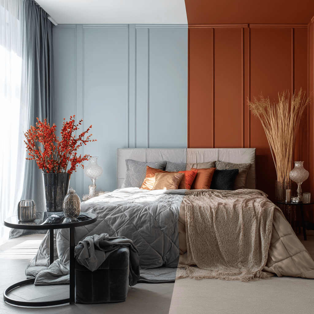
Warm Colors for Passion and Connection

Warm colors—reds, oranges, and pinks—sit on the active end of the color spectrum. They advance visually (appearing to move toward the viewer), increase energy, and stimulate both mind and body.
Reds: The Color of Passion
Red, with its associations to blood and fire, naturally triggers physiological responses: slightly elevated heart rate, increased respiration, and even a small rise in body temperature. These physical changes mirror what happens when we feel attracted to someone, which is why red has long been associated with romance and passion.
But there's an important distinction to make: while red can enhance passion, too much can overwhelm. A completely red bedroom might feel stimulating initially but can quickly become exhausting.
Interior design principles suggest that red works best as an accent in the bedroom. A deep burgundy throw pillow, a cherry-toned picture frame, or artwork with red elements can introduce the energy of passion without overwhelming the senses.
Oranges: Warmth and Communication
Orange combines the passion of red with the friendliness of yellow, creating a color that promotes both physical comfort and emotional expression. Less intense than red, orange encourages conversation and sociability—key components in maintaining relationship intimacy beyond the physical.
Terracotta, coral, and peach tones are particularly effective in bedrooms, offering warmth without overstimulation. These softer oranges create an environment where couples feel both energized and comfortable enough to open up.
Pinks: Nurturing Love
Pink, especially in its softer shades, has a unique effect on the nervous system. It initially produces a calming response but can become energizing with prolonged exposure. This dual nature makes it perfect for spaces where you want both relaxation and romantic connection.
Contrary to outdated gender stereotypes, pink can work beautifully in adult bedrooms when used thoughtfully. Blush tones paired with charcoals or navies create sophisticated spaces that balance feminine and masculine energy, promoting equality in relationship dynamics.
For couples looking to incorporate warm colors without repainting, consider:
-
Adding rust, terracotta, or coral accent pillows
-
Installing amber-tinted lighting for evening hours
-
Choosing artwork with warm color accents
-
Using copper or brass decorative elements for a subtle warm metallic glow
Cool Colors for Relaxation and Tranquility
Cool colors—blues, greens, and purples—visually recede, creating a sense of spaciousness and calm. They lower blood pressure, reduce respiratory rate, and prepare the mind and body for rest.
Blues: Trust and Tranquility
Blue is consistently rated as the most calming color in research studies. It physically slows heart rate and reduces blood pressure, creating ideal conditions for restful sleep. But blue's benefits extend beyond physical relaxation—it's also associated with trustworthiness, loyalty, and emotional security.
For couples, a blue bedroom can create a foundation of calm where difficult conversations feel safer and vulnerability becomes easier. When we feel physically relaxed, we're more likely to open up emotionally.
Sleep research has consistently shown that couples who sleep well together report better relationship satisfaction. Studies from the National Sleep Foundation indicate that calming colors like blue can improve sleep quality, potentially adding valuable rest time compared to bedrooms with more stimulating color schemes.
Greens: Balance and Renewal
Green occupies the center of the visible spectrum, requiring no adjustment from the eye and creating an immediate sense of balance. Associated with nature and renewal, green bedroom environments can reduce stress and promote feelings of harmony.
This makes green particularly beneficial for couples navigating stressful periods or seeking to restore balance to their relationship. The restorative quality of green creates a psychological environment where healing and reconnection can occur naturally.
Sage, moss, and eucalyptus tones are especially effective in bedroom settings, providing calming benefits while remaining warm enough to feel welcoming.
Purples: Thoughtfulness and Intimacy
Purple combines the calmness of blue with the warmth of red, creating a unique balance that can enhance both relaxation and intimacy. Historically associated with luxury and contemplation, purple encourages introspection and meaningful connection.
Lighter lavenders promote restfulness while deeper aubergines and plums can create a sense of cocoon-like security. For couples, this combination offers the perfect environment for both physical intimacy and deep conversation.
Easy ways to incorporate cool colors include:
-
Layering blue-toned bedding in different textures
-
Adding plants for natural green elements
-
Using lavender or sage scented candles to enhance the sensory experience
-
Choosing artwork with peaceful blue or green landscapes
Neutral and Earth Tones for Balance and Harmony
Neutral colors—whites, beiges, grays, and browns—create a foundation of stability. Rather than evoking specific emotional responses, they provide a balanced backdrop that can be calming or energizing depending on the accents paired with them.
Whites: Clarity and Possibilities
White creates a sense of cleanliness and possibility. In a relationship context, a predominantly white bedroom can represent a fresh start or blank canvas—ideal for couples defining or redefining their relationship.
However, stark whites can feel clinical. To create intimacy, opt for warmer whites like ivory, cream, or white with the slightest hint of pink undertone. These create brightness without sacrificing warmth.
Earth Tones: Grounding and Security
Browns, tans, and warm grays connect us to the earth, creating a sense of stability and security essential for deep intimacy. These colors speak to our primal need for shelter and safety, allowing couples to feel protected and grounded together.
Research in environmental psychology suggests that earth tones in the bedroom create a psychological environment where couples may feel more secure. This sense of safety and groundedness can support vulnerability—when we feel protected by our surroundings, we're more likely to open up emotionally and physically.
Taupe, camel, and walnut tones work particularly well in bedrooms, offering warmth without the stimulation of more vibrant colors. These shades also provide an excellent backdrop for personal items and meaningful décor that tell your story as a couple.
Grays: Sophistication with Nuance
Gray has emerged as the new neutral of choice for many designers, offering sophistication and subtlety. The key is choosing the right undertone—warm grays with hints of brown or purple create more intimate spaces than cool grays with blue undertones.
For couples, the right gray palette can create a mature, refined space that feels both calming and elegant. Add textural elements in similar tones to create depth without color contrast.
Ways to warm up neutral spaces:
-
Layer different textures in similar tones
-
Add natural wood elements
-
Incorporate metallic accents (brass, copper, bronze)
-
Use amber lighting in the evening hours
-
Include personal photographs in warm frames
Finding Your Perfect Color Combination

Creating the perfect bedroom color palette is highly personal and should reflect both partners' preferences and needs. Here's how to find your ideal combination:
Honor Both Partners' Preferences
Successful shared bedrooms acknowledge both individuals' color preferences, even when they differ. This might mean:
-
Using one partner's favorite color for accent pieces
-
Finding a compromise shade you both enjoy
-
Using neutrals as a base with each person's preferred colors as accents
-
Designating different areas of the room for different color influences
Remember that seeing your preferences acknowledged in your shared space reinforces that your needs matter in the relationship.
Apply the 60-30-10 Rule
Professional designers often use the 60-30-10 rule to create balanced spaces:
-
60% dominant color (walls, large furniture)
-
30% secondary color (bedding, curtains, seating)
-
10% accent color (accessories, artwork, throw pillows)
This approach creates visual harmony while allowing for personalization. For couples, consider using the dominant color to promote the emotional atmosphere you most want (relaxation, passion, or balance), then use secondary and accent colors to represent each partner's preferences.
Test Before Committing
Colors look different in different spaces, lighting conditions, and times of day. Before painting an entire room:
-
Get large paint swatches or sample pots
-
Paint 2' x 2' sections on different walls
-
Observe the colors at different times of day
-
Notice how the colors make you feel individually and as a couple
-
Pay attention to how the colors look with your existing furniture and bedding
Consider Feng Shui Principles
Feng shui offers additional insights for couples seeking harmony through color. According to these principles:
-
Earth tones and pinks support nourishing relationships
-
Too much red can lead to conflict
-
Blue and green promote healing and growth
-
Black should be used sparingly as accents only
-
Colors should be balanced between yin (cool/passive) and yang (warm/active)
While you don't need to follow these principles strictly, they offer interesting perspectives on creating balance in shared spaces.
Personalization Strategies Using Color
Beyond basic color psychology, personalization is what transforms a bedroom from a nice space into a meaningful environment that supports your unique relationship.
Incorporate Colors From Shared Memories
Colors carry powerful associations with experiences. Consider:
-
The colors from the place you met
-
Shades from a favorite vacation destination
-
Tones from your wedding or commitment ceremony
-
Colors associated with shared hobbies or interests
Consider how meaningful color connections can enhance your space. Imagine painting your bedroom the exact shade of blue from the lake where you first said "I love you," or incorporating the sunset colors from a memorable vacation. These personalized color choices can create powerful emotional anchors in your environment.
Use Color to Create Emotional Zones
Different areas of your bedroom can support different aspects of your relationship:
-
Restful sleep area with calming blues or greens
-
Intimate seating area with warming earth tones
-
Energizing dressing area with more vibrant accents
-
Reflective space with purples or deeper blues
This zoning approach allows your bedroom to support multiple relationship needs simultaneously.
Seasonal Adjustments
Consider making subtle seasonal changes to keep your space fresh and aligned with natural cycles:
-
Winter: Deeper tones and richer textures for coziness
-
Spring: Introduce fresher greens and soft florals
-
Summer: Lighten the palette with airy blues and whites
-
Fall: Warm the space with amber, terracotta, and gold
These seasonal shifts create novelty that can keep your space—and by extension, your relationship—feeling fresh and evolving.
Taking Your Bedroom Design to the Next Level
Understanding color psychology gives you powerful tools for creating a bedroom environment that supports and enhances your relationship. But color is just one element of a fully personalized romantic space.
To truly transform your bedroom into a sanctuary that tells your unique love story, consider exploring our Personalized Romantic Bedroom Decor Guide. This comprehensive resource builds on color psychology principles while helping you incorporate personalized elements, meaningful arrangements, and sensory experiences tailored to your relationship's unique character.
Whether you're newlyweds creating your first shared space, long-term partners refreshing your environment, or somewhere in between, intentional color choices lay the foundation for a bedroom that nurtures intimacy, communication, and connection. Your relationship deserves a space as unique and thoughtfully designed as the bond you share.
What colors have you found most effective in your bedroom? Have you noticed how different colors affect your relationship? Share your experiences in the comments below!